
In today’s fast-paced digital landscape, a well-designed website is crucial for businesses seeking to stand out from the competition. However, providing an exceptional user experience (UX) on your website goes beyond attractive visuals and compelling content. It’s about creating intuitive, user-friendly, and delightful interactions that meet and exceed users’ expectations.
Prioritizing UX on your website not only boosts user satisfaction but can also result in attracting and retaining clients, driving conversions, and fostering long-term business success.
Website user experience encompasses all aspects of the end-user’s interaction with a website, from the ease of navigation to the effectiveness of information and the overall look and feel. A positive website user experience is critical for SMEs as it helps create a strong digital presence, improves search engine rankings, heightens customer satisfaction, and, ultimately, fosters long-term business growth. When users have a positive experience on your site, they are more likely to return, recommend your services to others, and become loyal customers.
In this blog, we delve into the significance of website user experience for small and medium-sized enterprises (SMEs) and outline best practices for improving your website’s UX to bring in more clients and increase overall growth.
A well-thought-out website design plays a crucial role in creating a positive user experience. It not only ensures that your site looks visually appealing but also, more importantly, serves the functional requirements of your target audience. When selecting a design for your SME’s website, consider the following factors:
1. Visual appeal: Use a visually pleasing color palette, fonts, and graphics to create an attractive design that aligns with your brand identity.
2. Content hierarchy: Prioritize the most important information on the site and make sure it’s easily accessible to users.
3. Consistency: Maintain consistent visual elements, such as color schemes, typography, and layouts throughout your site to create a cohesive user experience.
Website speed is a critical factor that influences user experience and search engine rankings. Slow-loading pages can frustrate visitors, causing them to leave your site and possibly turn to competitors. To optimize your SME’s website for speed, consider implementing the following strategies:
1. Optimize images: Compress and resize images before uploading them to your website to decrease file sizes and improve load times.
2. Enable caching: Caching stores a saved version of your website on users’ devices, reducing the time it takes to load the page when they revisit it.
3. Minimize HTTP requests: Reduce the number of external files your website needs to load, such as CSS, JavaScript, and image files, to improve site speed.
Intuitive navigation is a crucial aspect of an outstanding user experience. It ensures that users can easily find and access the information they need without getting frustrated. To provide a seamless navigation experience for your SME’s website, follow these best practices:
1. Logical site structure: Organize your website’s content in a logical, hierarchical manner, creating clear categories and subcategories.
2. Consistent navigation menu: Display a consistent navigation menu on every page of your website, allowing users to easily access different sections of the site.
3. Implement clear call-to-action (CTA) buttons: Strategically place CTA buttons throughout your site to guide users toward taking the desired action, such as contacting you, subscribing to your newsletter, or making a purchase.
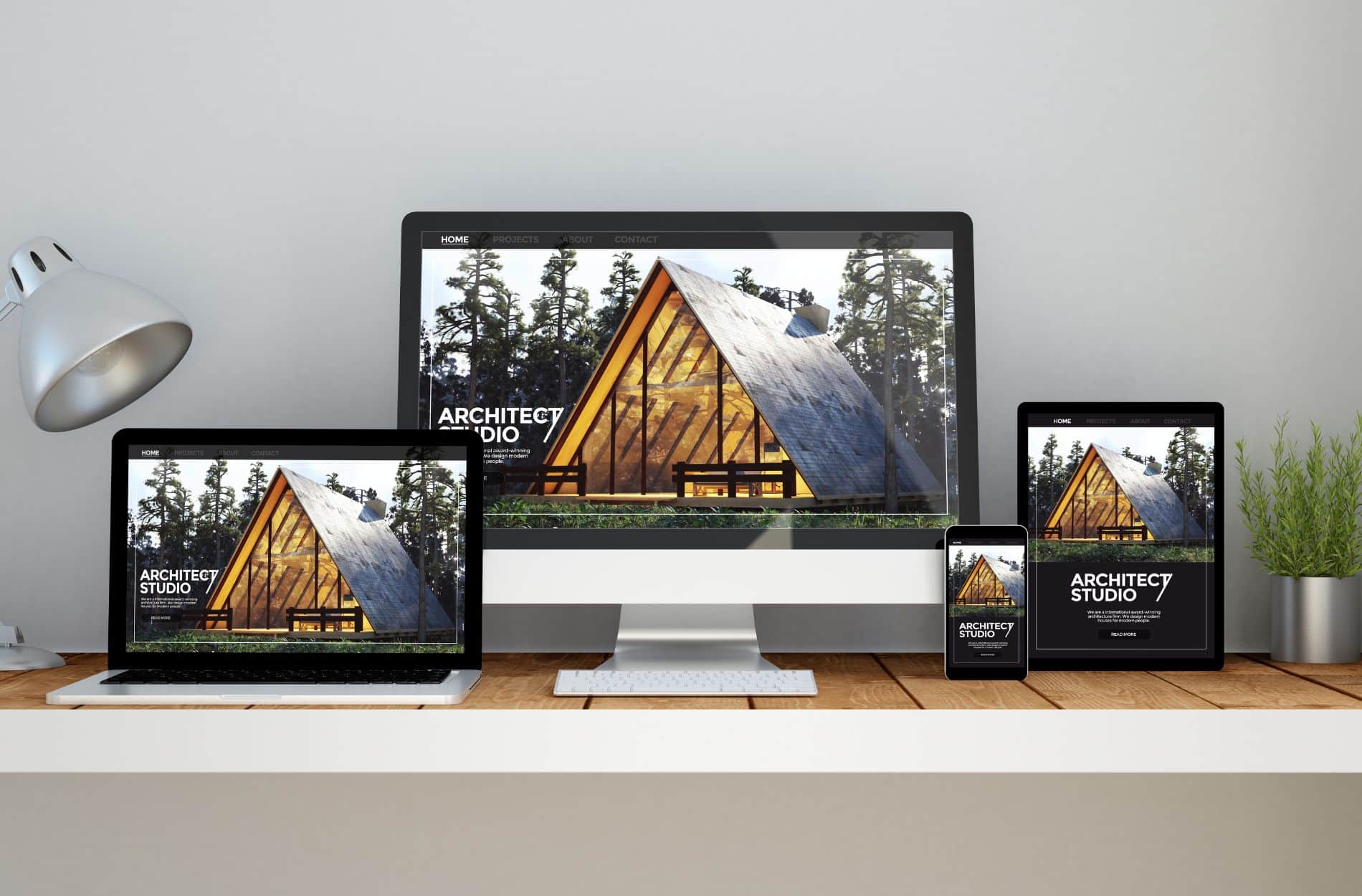
With an increasing number of people accessing the internet via various devices, it’s essential to create a website that performs well on different screen sizes and resolutions. Responsive design ensures that your website’s layout, images, and functionality adapt seamlessly to different devices, providing users with a consistent user experience. To implement responsive design, adopt the following strategies:
1. Flexible grids: Use fluid grids that adapt to different screen sizes by using relative units, such as percentages, instead of fixed units like pixels.
2. Fluid images: Apply CSS rules to ensure images automatically scale and resize according to the screen resolution.
3. Media queries: Utilize media queries to adapt your website’s layout and design elements based on specific device characteristics, such as screen width or device orientation.
Creating a website with an exceptional user experience is vital for small and medium-sized businesses seeking to attract new clients and drive business growth. By choosing the right website design, optimizing site speed, enhancing website navigation, and utilizing responsive design principles, SMEs can build user-friendly websites that not only delight users but also encourage them to engage with their offerings and become loyal customers.
As the digital landscape continues to evolve, it’s paramount for businesses of all sizes to prioritize user experience, cultivating a strong online presence that fosters long-term success and sustainability.
If you’re on the hunt for Baxter web design services, Mixture Web is the best partner for you. We specialize in developing websites that not only reflect your professionalism but are also adaptable to your business growth. Check out our packages by giving us a call today!


© Copyright 2023 Mixture Web LLC | Terms and Conditions | Privacy Policy
